Table of Contents


Want to Boost Rankings?
Get a proposal along with expert advice and insights on the right SEO strategy to grow your business!
Get StartedGoogle has revealed a refreshed design for its iconic “G” logo, giving it a brighter four-color gradient that will now represent the company across all products, platforms and services.
At first, a logo change may seem like a small design tweak. But for Google, this update signals a statement about identity, evolution and how the company wants to position itself in the AI-driven future.
Free SEO Audit: Uncover Hidden SEO Opportunities Before Your Competitors Do
Gain early access to a tailored SEO audit that reveals untapped SEO opportunities and gaps in your website.

And as I think about it, one question stands out: is this just a new look or is it Google’s way of telling us how deeply AI is reshaping everything it does?
What Exactly Changed in Google’s Logo?
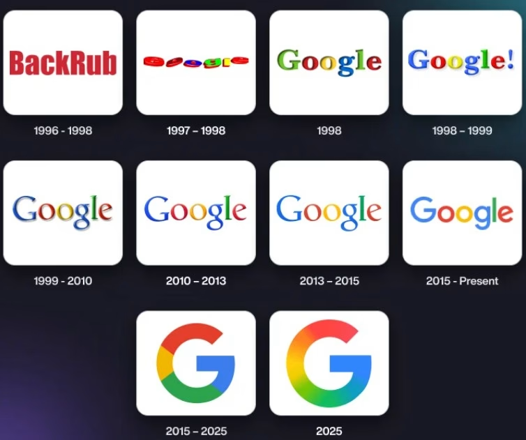
Ten years ago, Google introduced its four-color “G” as a unifying symbol across platforms.
It carried the same hues we all recognized from the full “Google” wordmark, condensed into a single, versatile emblem.
Earlier this year, Google experimented with a brighter gradient version of the “G” inside Search.
Now, the company has decided to extend this refreshed icon across all of Google. The brighter hues bring more contrast and vibrancy, while the gradient design reflects movement, energy and creativity.
The new “Google G” keeps the familiar palette of blue, red, yellow and green but it does so with a bolder punch, visually connecting with the surge of innovation Google associates with its AI era.
Why Did Google Decide to Update Its Logo Now?
Logos often change when companies want to signal a shift in direction or identity.
For Google, the timing coincides with its growing transformation into an AI-first company.
Think about the pace of developments: Gemini AI, generative search, new Android AI features, and the integration of AI into Workspace.
The brighter “G” is meant to capture that sense of forward momentum.
According to Google, the gradient represents “the surge of AI-driven innovation and creative energy across our products and technology.”
In other words, this is branding in service of a bigger story: the story of Google evolving from a search engine to a global AI platform.
How Does This Fit Into Google’s History of Design Evolution?
Google’s logo journey has always paralleled its technological shifts.

- In the late 1990s, the first wordmark reflected a scrappy internet startup.
- In 2015, Google unveiled its current geometric wordmark and the four-color “G,” marking a new chapter of design uniformity across web, mobile, and devices.
- Now, in 2025, the brighter gradient “G” reflects the AI revolution the company is driving.
Each time, the design updates were not just about fonts or colors; they were about signaling what Google had become at that moment.
What Does the New “G” Symbolize?
The symbolism here is layered.
- Brighter hues: Representing clarity, optimism, and accessibility in an age when AI is shaping everyday interactions.
- Gradient design: Signifying dynamism, adaptability and the blending of human creativity with machine intelligence.
- Consistency: By extending the design across all products, Google emphasizes that AI is not limited to Search or Gemini; it is a company-wide transformation.
So while the shape has not changed, the feel of the logo is designed to evoke a world that is faster, smarter and more vibrant with qualities Google wants us to associate with its AI-driven tools.
Where Will We See the New “Google G”?
Google has already rolled out the brighter “G” in Search and the Gemini spark icon earlier this year.
Now, it will extend across more products and platforms in the coming months.
That means you will see it in places like:
- Chrome and Android apps.
- Workspace tools like Gmail, Docs and Meet.
- Hardware like Pixel devices.
- Services like YouTube and Maps.
Everywhere Google touches your digital life, the brighter “G” will become the visual anchor.
How Does This Connect to Gemini and AI?
Google first introduced the brighter “G” in the Gemini spark icon back in June. Gemini represents the company’s most advanced AI model and its centerpiece for generative AI innovation.
By bringing the same design language to the corporate “G,” Google is essentially aligning its brand identity with its AI identity.
Key Takeaways
- Google has updated its iconic “G” logo with a brighter four-color gradient.
- The new “G” will now represent the company across all products, platforms, and services.
- The gradient and hues symbolize AI-driven innovation, creativity, and energy.
- The update reflects Google’s shift into an AI-first identity without losing its iconic design language.
- For users, it’s a visual refresh; for Google, it’s a brand-level statement about the AI era.
About the author
Share this article
Find out WHAT stops Google from ranking your website
We’ll have our SEO specialists analyze your website—and tell you what could be slowing down your organic growth.


