


Favicon SEO Benefits: Is It Really Important in 2025?
Reading Time: 10 min read

Written by Dileep Thekkethil
- Updated on Jun 7, 2025
Table of Contents


Want to Boost Rankings?
Get a proposal along with expert advice and insights on the right SEO strategy to grow your business!
Get StartedWhen it was introduced in 1999 by Internet Explorer, Favicon was not an essential component for websites.
But over time, this small 16×16 size icon that appears on the browser tab is sort of becoming an important SEO factor, not only for designers but also for SEO professionals. Shall we find out why?
What Is a Favicon Image?
A Favicon (acronym for “favorite icon”) is a small image that you can use on your website to help the users identify your tab easier when they have multiple ones opened. Of course, this has little impact on SEO.
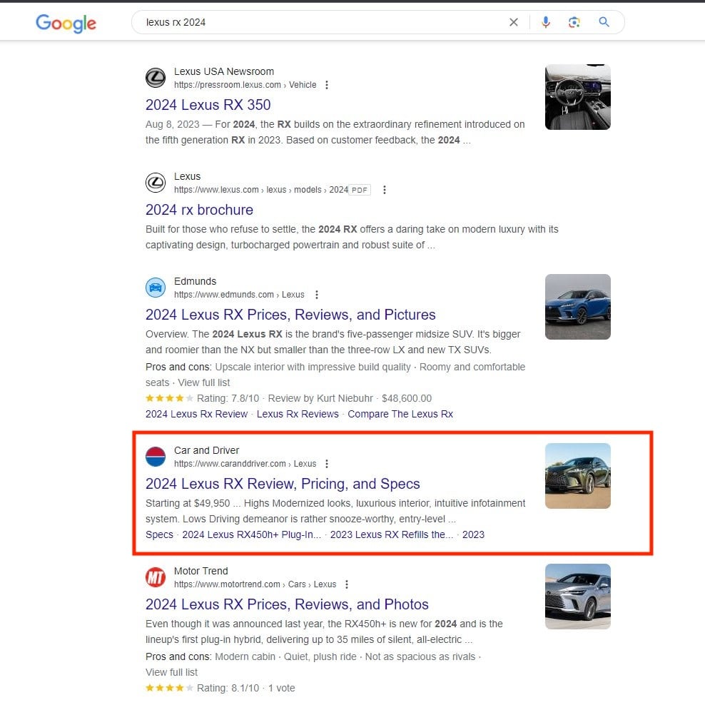
But things started to change in late 2019 when Google began using the Favicons when displaying the search results on mobile devices.
Free SEO Audit: Uncover Hidden SEO Opportunities Before Your Competitors Do
Gain early access to a tailored SEO audit that reveals untapped SEO opportunities and gaps in your website.
Recently, Google even launched a version of the desktop result, which had Favicon. However, they reverted back the change after people complained of clumsy design.
However, Google continues to test Favicons on its desktop results, and sooner or later, they will roll it out with minor tweaks.
If you look at other search engines such as DuckDuckGo, you can find Favicons in both desktop and mobile search results.
What Is the Use of Favicon?
Of late, websites have been using Favicons as part of the strategy to increase the click-through rate.
Some highly recognized brands benefit from it as it becomes easier for users to identify and visit a popular brand with the icon displayed.
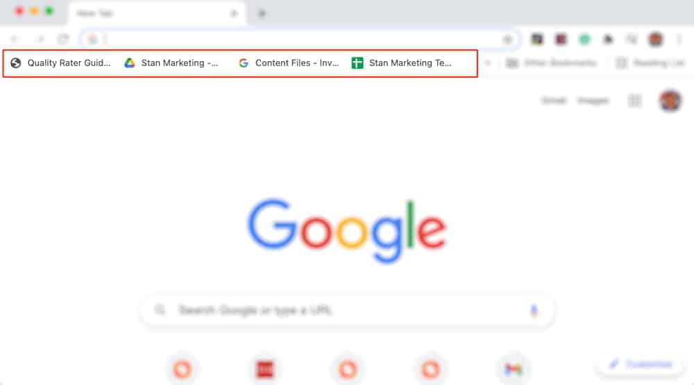
And of course, with people now opening an average of 10-11 tabs on their Browser, Favicon definitely serves its purpose.
Some people mistake favicons for logos. 99% of the time, the logo design is converted into a favicon, but it’s saved in a different location. Also, it’s smaller than the conventional logo size.
Where Can You See the Favicon?
Consider Favicon as a feature that helps users identify your website from a host of other sites. That means it’s visible on all browsing features where your website has found a place.
For Example:
1) Search Results

2) Bookmarks
3) Browser Tabs

4) Toolbar Apps

5) Browser History

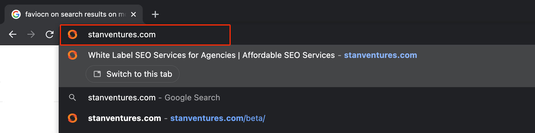
6) Search Bar
Why Are Favicons Important?
Alright. Let’s talk a bit about the importance of Favicons.
In this new era, businesses should create a favicon, meaning It’s a small but vital step to setting up a business website.
Favicons are an excellent way to convey your brand online and make your website look more professional.
They serve as visual indicators for Websites, enabling an easy and quick way for the visitors to find your page when there are multiple similar tabs open.
SEO Benefits of Having Favicons
So, is a favicon important for SEO?
As I mentioned before, Favicons are not directly responsible for higher rankings on search engines. Let me reiterate that it’s also not a ranking factor!
But a Favicon can definitely help in SEO.
- As you know, the websites that get a high click-through rate and dwell time always get the upper hand in SERP rankings. A website with Favicon on the search result is bound to get more click than the one which doesn’t.
- When users can identify your Website inside the bookmark, history, or among multiple tabs through the Favicon, it increases the interaction, and the users are not distracted by other websites that may be offering similar information as yours.
- Favicons help in branding your Website. Users are made accustomed to your brand logo, and this tends to trigger brand recollect. When they see the logo next time while searching on Google or within multiple browser tabs, they have the tendency to click on it. Provided they were happy with the first experience offered by your Website.
How to Create Good Favicons
Favicon is a small yet essential image. It should be simple and recognizable for your audience. It is important that the Favicon leaves a lasting impression on users because it will help them identify your brand later.
Here are some Favicon best practices you should follow.
1. Make It Attractive and Recognizable
Until recently, Favicons just had to be identifiable to the users who land on one of your pages. But this has changed with search engines starting to show the Favicon on search results pages.
It’s now necessary to make the Favicons both attractive and recognizable. When a user finds your search result with an unrecognizable or unrelated Favicon, it may deter them from clicking your results.
Also, when the top competitors appear with better Favicons, the users are naturally attracted to them. Since this happens even before they visit your page, it’s essential to develop an attractive Favicon.
2. The Best Favicon Is Your Logo
The purpose of having a Favicon is to create a connection between your Website and the users. With the rise of the internet, users are now accustomed to identifying a brand using logos.
Since your website’s logo is the best identification symbol that you can provide to the users, it’s recommended to use the resized version of your logo as Favicon.
3. Avoid Text
The size of a Favicon is 16×16 pixels. That said, trying to add text inside it serves no purpose because the users cannot read it. Also, adding text reduces the real estate of the logo, which will further reduce the Favicon’s clarity.
4. Don’t Use a Photo
Using a photo as Favicon is a bad practice as photos are not intended to be so small. A 16×16 size photo will look blurred and the users will never be able to recognize what is inside it, which means you lose the benefit of having the Favicon.
5. Consider Dark Mode
We have seen an increase in the number of browsers supporting dark mode. Chrome browser, for example, looks pretty cool when used in dark mode, and most of the users are adapting to the change because it’s less stressful for the eyes.
So, consider creating two versions of the Favicons to support both light and dark themes. You may need a little bit of coding help to implement this. Check out this page to know how to enable dark Favicon.
If coding is not your forte, just keep the Favicon transparent so that it doesn’t look awkward on dark themes.
6. Consider the Size of a Favicon
In general, the recommended size of a Favicon is 16×16 pixels or 32×32 pixels. However, to accommodate various platforms and devices, they can range from 48×48 to even 512×512 pixels for optimal display and clarity.
How to Show Favicon on Search Results?
Here is what Google Recommends website owners to do if they want Favicons to appear in search results.
Step 1: Create a favicon.
Step 2: Add a tag to the header of your home page with the following syntax:
The URL of the Favicon. It can be a relative path (https://0d9261c0.delivery.rocketcdn.me/smile.ico) or an absolute path (https://example.com/smile.ico), but it must be in the same domain as the home page.
Note: Earlier, it was mandatory to use the .ico file name for the Favicon, but now all browsers support .png .svg formats.
Google’s Favicon Guidelines Updated
Not all favicons will show up on search results, even if you have implemented the right steps. Google says showing a favicon on SERPs is under its discretion, and even when all guidelines are followed, a favicon’s appearance in results is not guaranteed.
In most cases, following these favicon guidelines will make a website eligible for favicons:
- Indexable by Googlebot-Image: Ensure that both the favicon file and the home page are accessible by Google’s Googlebot-Image crawler and are not blocked. This is essential for Google to retrieve and display your favicon correctly.
- Unique and Brand-Representative: The favicon should visually represent your brand, helping users recognize your website in search results.
- Size and Aspect Ratio: According to Google’s updated guidelines, the minimum size of a Favicon should be 8×8 pixels (no longer 48×48 pixels as previously required) with a 1:1 aspect ratio. However, using a favicon larger than 48×48 pixels is recommended for better visibility on various devices. Google will resize all favicons to 16×16 pixels in search results, but high-resolution icons enhance clarity.
- Hostname Limitation: Google only supports one favicon per hostname. For instance,
www.example.comandcode.example.comcan have separate favicons since they’re unique hostnames. However, a subdirectory (e.g.,example.com/news) shares the main domain’s favicon. - URL Stability: The favicon URL should remain stable, so avoid frequent changes. Stability improves consistency in search results and enhances brand recognition.
- Appropriate Content: Google enforces strict guidelines against inappropriate content in favicons, such as hate symbols or explicit imagery. Such favicons will be replaced with a default icon.
Google’s revised documentation on favicons is designed to empower web developers and site administrators with clear and streamlined information on using favicons on websites effectively. Here’s a summary of the key changes and updates that will enhance your understanding and implementation:
- Legacy vs. Modern Favicons: The updated documentation distinguishes between older (legacy) and newer (modern) forms of favicons, aiming to guide users on current Favicon best practices and deprecated methods.
- Revised Sections:
- Removed: The section ambiguously advised setting the rel attribute with terms like icon, apple-touch-icon, apple-touch-icon-precomposed, and shortcut icon. The terminology was considered too jargon and less informative.
- Replaced: This has been replaced with clearer guidance:
- icon: The standard favicon as defined by HTML specifications.
- apple-touch-icon: An iOS-friendly favicon according to Apple’s developer documentation.
- apple-touch-icon-precomposed: For older iOS versions, also detailed in Apple’s documentation
Support for Legacy Methods
The documentation includes a note that for historical reasons, Google supports using shortcut icons, a non-standard method for linking a favicon (using rel=”shortcut icon”). However, rel=”icon” is the standard and recommended method.
The new documentation also features a callout box emphasizing the continued support for the shortcut icon due to historical reasons, signaling Google’s flexibility and support for older web practices for better compatibility.
Google is Testing New Favicon Dimension
Google is testing displaying an expanded version of the favicons. In the new favicon dimension test, the favicons take up the full space of the square box. Currently, the favicon is centered and surrounded by a white background.
The new change can make the favicons more visible and distinctive. However, there are changes that the new change in the dimension can change the design and appearance of the favicons of a few brands, especially those that have transparent or inverted elements.
For example, in the test shared by Glenn Gabe on X, the favicon of Car and Driver, a website that provides car reviews and news, looks more like a red square with a white letter C, rather than a car wheel with a C inside.
In a test where Google is displaying an interesting version of site favicons. They are expanded to take up the full space, which can really change the design. E.g. check out the car and driver favicon in the test and then the Nike favicon (which is reversed). I think I like the… pic.twitter.com/03RSsDhol7
— Glenn Gabe (@glenngabe) November 20, 2023
Similarly, the favicon of Nike, a sports brand, looks more like a white check mark on a black background, rather than a black check mark on a white background.
Some people may prefer the test version of the favicons, as they may think it is more eye-catching and consistent. Others may like the current version of the favicons, as they may think it is more faithful and original to the site’s design. Ultimately, it is a matter of personal preference and taste, and Google may or may not implement the test version in the future.
About the author


Share this article


Find out WHAT stops Google from ranking your website
We’ll have our SEO specialists analyze your website—and tell you what could be slowing down your organic growth.


Related Blogs


